4 Benefits of Big Data Visualization for Government Contractors
Subjected to the right analytics, the vast amounts of data businesses create and store in the process of their operations can yield powerful predictive insights. Using these insights to make decisions requires both the technical tools to analyze large data sets and the capacity to translate analyzed data into visually compelling formats through a process called big data visualization.
The global datasphere has grown 1,200% in the last decade and will double again by 2025. As big data expands, so does the market value of analyzing and processing it. In 2018, the big data analytics sector had an estimated value of $37 billion. According to current projections, this value will rise to $105 billion in the next five years.
The business of big data analytics has already radically changed the competitive landscape for half of businesses. In 2022, federal contract spending will focus on small businesses, supply chain security, and COVID-19 relief. For businesses looking to capitalize on these opportunities, big data analytics and visualization offer a competitive edge both for proposals and deliverables. Let’s look at what big data visualization is and how it can benefit your business.
What is Big Data?
The term big data refers to data sets too large to be stored, analyzed, or manipulated by traditional relational database management systems. Compared to the human mind, the computational capacities of programs may seem infinite. Nevertheless, they have upper limits in the amount of data they can handle and beyond, which become either faulty or too slow to use for practical purposes.
At what size does data become big? Depending on the complexity of the queries and analytics involved, data sets may begin to exceed the limitations of commonly used software at the scale of terabytes – 1s followed by 12 zeros. In other applications, the data sets may involve zettabytes of information – 1s followed by 21 zeros. In either case, whenever analysts must apply categorically different approaches such as parallel processing, the data sets in question have acquired “big” features.
What is Big Data Visualization?
Big data needs to be packaged and presented in ways that make sense and communicate actionable insights to people of different skill sets and professional backgrounds. With big data visualization, you can use visual aids to translate large data sets into intelligible and actionable formats.
When analysts present data to decision-makers, they may know little to nothing about the skills and backgrounds of individuals in the room. Nevertheless, they can reasonably expect most – about 65% – to be visual learners capable of seeing meaningful patterns in visual representations of numerical or statistical data.
Visual representations of big data may take a variety of forms rendered statically or dynamically.
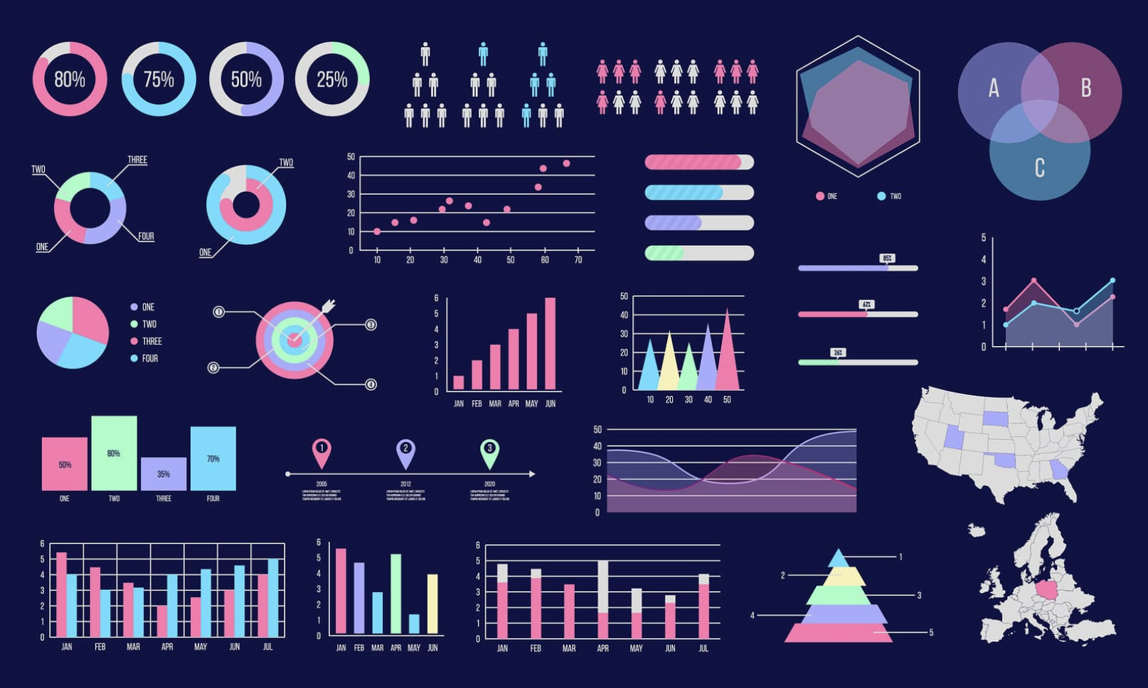
- Tables
- Charts
- Graphs
- Maps
- Timelines
- Matrices
- Scatterplots
- Word clouds
Analysts preparing visual aids can select formats that emphasize targeted points.
4 Benefits of Big Data Visualization
Visualization can improve the presentation of big data analytics and lead to better overall decision-making in several measurable ways. Here is a list of four data visualization benefits.
- Faster Communication
Data analysts don’t measure categorically big data in volume only. They also measure it in velocity. The rate at which an organization accumulates new critical data to analyze determines how often and how quickly those responsible for interpreting it must make decisions.
People can process meaningful pieces of visual information in approximately 13 milliseconds – about 30 times faster than the eye can blink and about 60,000 times faster than the brain can read a comparable volume of textual information.
When time counts and leaders need to make informed decisions quickly, visualization can deliver the salient points in a small fraction of the time it would take to get everyone on the same page with text-based information.
- Enhanced Pattern Recognition
While people can’t compete with the raw computational power of machines, they still outperform programs and algorithms in one critical category. When presented with a visual representation of statistical data or a sequence of events, the human mind has an unrivaled capacity for pattern recognition.
Rendering data in a variety of visual formats can reveal patterns and correlations that would otherwise elude detection. This process creates constructive feedback. Programmers can use recognized patterns to tweak database schemas and queries to yield further insights in a refining cycle.
- Reduced Barriers to Communication
Data visualization doesn’t change the content of data. It merely presents it in more accessible formats. Relational databases store data in a format that is high in precision but minimal in accessibility. Only users with a technical understanding of how to write queries can extract and use information.
Data visualization, on the other hand, expresses information in the broadest range of accessibility, reducing technical prerequisites for meaningful discussion. With sufficient visualization in play, the conversation opens to everyone in the room. In certain visual contexts such as maps and timelines, audiences don’t even need to share a high degree of fluency in the same spoken language to build a common understanding of important concepts.
- Memorable Presentation
Presented with facts and statistics, people forget approximately 50% of the information they’re exposed to within an hour. In 24 hours, the loss rate rises to 70%. Nevertheless, people remember and tell stories in vivid detail for years. Storied memories often persist into old age when other memory faculties decline.
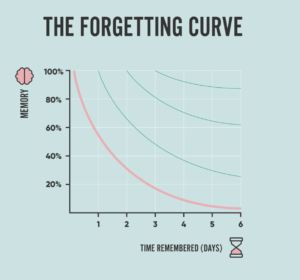
Studies in neuroscience tracking subjects’ brain activities under MRI and their memories months afterward have found that metaphors and stories can produce stable structural changes in the brain that persist on the order of months to years. Stories give information a kind of glue that it otherwise lacks, tying together disparate pieces of information in a single memorable narrative.
In many formats, visualization creates a narrative. Narratives can make the difference between critical information being quickly forgotten or having a meaningful impact on decisions down the road.
Government Contracting Solutions with Rainmaker
Government contracting often presents businesses with unique CRM challenges. Businesses new to the field may struggle to manage multiple silos of information that lack real-time overhead visibility.
At Rainmaker, our team of experts has a proven track record of helping clients configure Salesforce and other CRM platforms to obtain and deliver government contracts.
To schedule a consultation and learn more, contact Rainmaker today.